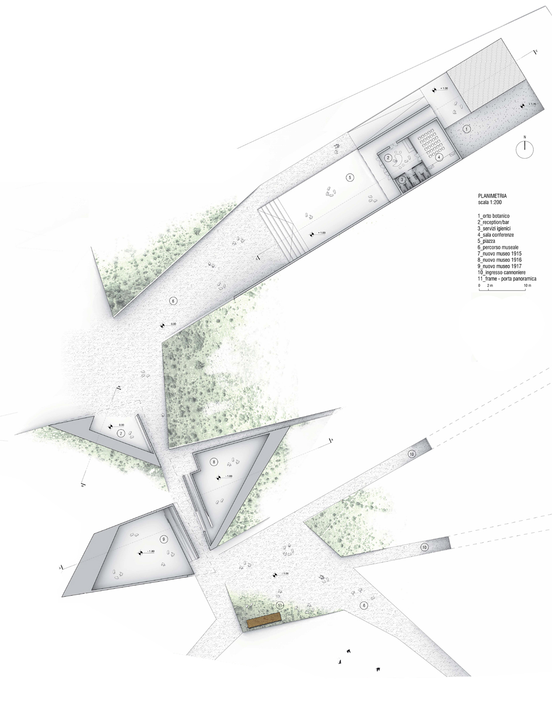
The San Michele Karst Area project in Gorizia integrates landscape design and indoor/outdoor museum elements, blending history with contemporary architecture. Through restyling existing structures and innovative pavilions, it aims to offer visitors a cohesive journey through the region’s rich heritage and natural beauty.
Program: Landscape design and indoor/outdoor museum design system of the San Michele Karst Area
Location: Gorizia, Italy
Client: Province of Gorizia
Assignment: ATENASTUDIO, KREJ engineering S.r.l., OSA, C&C architettura ingegneria s.r.l., ATA GROUP S. p. A ., Alessandro Sacchet, Stefano Piccioni, Leonardo Filesi, Vilma Fasoli, Made office
Schedule: I phase: April 2010 | II Phase: July 2010
Status: II Phase
Lot Area: 50,000sqm
Total Cost: 1,000,000 Euro
Awards: 4th Prize


The idea of a museum on Monte San Michele has the aim to return to the community a space in which its history, and the memory of the events which took place coexist and offer visitors the opportunity to explore and experience them all together. The functional program includes a series of interventions (restyling existing museum, new museum, open-air museum) that have been integrated into a sequence of flows and paths and allow the same way to pass freely, at any time, from one environment to another, from experience to another. In this project, the new museum is not the protagonist but instead blends into the landscape. The concept is based on the exasperation of a formal relationship between old and new: where the old has become a pure object thanks to restyling of the existing museum, the new museum is generated by a tectonic movement. The building that houses the museum is today renovated and turned into an object stereometric.
The current colonnade becomes a wall on which stands a ramp leading into the volume. Taking advantage of the existing masonry the volume has been reinterpreted by playing with the function of the collonade that frames the beginning of the museum and then the new square design. From the point of view of distributive functional inner spaces are designed to accommodate a conference room, reception service/ticket office, toilets, and activity bar/refreshment. The new square design is raised 1 meter above street level and it is designed as a natural extension of the restyling of the building. The new museum is formed by three pavilions, generated by a sweet detachment of the ground surface that rises, bends, and deforms to become a roof. The three pavilions are separate volumes, in which multimedia experiences help to increase the participation of the visitor in his journey through history.

Via E.Scalfaro, 3/5
00144 ROMA, ITALY
+39.06.96.52.00.79
contact@atenastudio.it
Dr. Tværgade 56
1302 Copenaghen
arch@amindrio.com
Dr. Tværgade 56
1302 Copenaghen
arch@amindrio.com
© 2005-2022 ATENASTUDIO All right reserved